At first glance I assumed something had gone haywire in the browser. It looks like a broken page with the photo pushed to the left and all that white space in the center. After several refreshes, and then opening the page in a new browser, I finally found my way to the flickr blog, and then the help forum, where I realized this was in fact done intentionally! Good grief.
Things thankfully get better when viewing a horizontal photo:
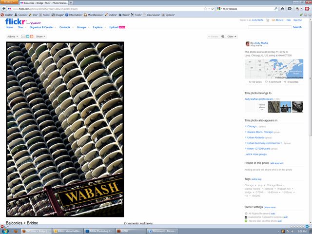
Then I realized that things get much worse. Here’s a vertical image where the image is much larger in height (as opposed to the previous image which was only 900px):
[UPDATE at the bottom of the page: flickr has fixed this problem]
Notice how the image is cut off and you have to scroll to see the whole thing. Even by scrolling I can't fit the entire image in the browser window. This was also done intentionally. You don't have to be a designer to realize that a photo sharing site should allow the view of an entire photo-- that's just common sense.
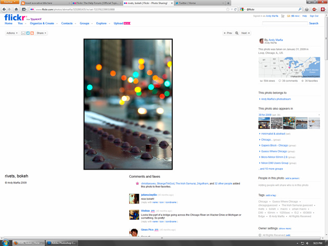
Finally, since this change only seems to be affecting photos posted after March of 2010, here's what every page in my archive from 2005 to 2010 looks like:
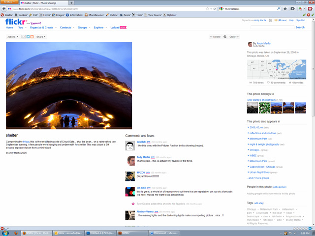
Again, you don't have to be a designer to realize this doesn't look right. This is bad design in 2012. Hell, it would have been bad design in 2002.
I've generally responded positively to changes that flickr has made in the past, but this new layout needs work and I hope they tweak it, a lot. As is, it ruins the consistency of the interface and makes the photo page for every photo in my archive look like broken CSS.
------------------
I'd be remiss in not mentioning the article in Gizmodo yesterday: "How Yahoo Killed Flickr and Lost the Internet". (Oddly timed on the same day that flickr rolled out this new layout). While I agree with the basic premise-- that Flickr & Yahoo have missed opportunities and most casual users have left for Facebook-- my experience on Flickr is not the same as the author's. I still find it to be a vibrant community of people who are passionate about photography, and I continue to have daily interaction there that I find meaningful.
------------------
UPDATE 5/16/12 9:30 PM
At some point this evening flickr released an update which solves my complaints about the vertical images getting cut off. It also centers the images so they now look like this:
I appreciate the resizing fix but I'm not sure centering is much of an improvement. Now, instead of white space on the right side we have huge patches of white space on the right AND left. Also, this separates the photo from the title, which just looks odd.
UPDATE 6/1/12
Flickr's liquid layout is also causing blurry photos for some users. This followup post has a couple of examples.
2 comments:
Curious if you've experimented with using Google+ as an outlet for your work. I know there are some fairly serious photo circles on there if you follow the right people.
Hey Tony. I haven't done much with Google+ yet, either for photography or just as a general social media outlet. I may delve into that more.
Post a Comment