UPDATE 06/13/12: Following a suggestion made in the help thread, I'm happy to note that FLICKR HAS REMOVED DOWNSAMPLING FOR ALL PHOTOS BELOW 1024px. For me, that effectively solves this issue. I'm going to leave this post in place for purely historical purposes.
-------------------
I wrote a couple of weeks ago about how I didn't care for Flickr's new "liquid" layout. My chief complaint at the time concerned the overall design of the site, and how the layout interacted poorly with vertical photos and also the smaller photos in my archive. I'm still annoyed by that, but a much bigger problem has come to the the forefront since then. Flickr's liquid design causes blurry photos.
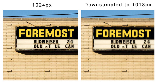
Here's an example of a horizontal photo exhibiting this problem:

Original image: www.flickr.com/photos/abmarfia/6773676926/
Both screenshots are from the photo page. At full screen the 1024px version is displayed on my monitor (which has a resolution of 1600x1200px). To achieve the 1018px version I simply resized the browser until Flickr's liquid layout starts to downsample the photo. I've noticed this effect is most pronounced between 800px and 1024px, and most obvious on photos that include text, like the one above. I can trigger this blurriness in Firefox, IE, and Chrome, and have tried it on at least three different Windows machines. It's not limited to just my own photos. I can make your photos look blurry too!
Here's a vertical photo:

Original image: www.flickr.com/photos/abmarfia/6833975456/
In this case, I'm comparing a photo from the photo page with the exact same photo (Flickr's 800px Medium size) from the All Sizes page. When I take the screen shot and crop them in Photoshop they are the exact same size, yet I'm clearly not seeing the same photo on both pages.
This is a pernicious problem-- it effects everyone, but not many people can actually see it. If you're viewing Flickr from a lower resolution monitor, chances are you're seeing the old 640px version of photos (which still look fantastic) and everything is hunky dory for you. Even for those with high resolution screens, not everyone will notice the problem. It's just subtle enough that someone who isn't concerned with sharpness may not notice or care. Or maybe they'll think something is wrong with their eyes!
Isn't that fantastic-- a photo sharing site that makes you question your eye sight?
I've complained about this thoroughly in Flickr's help thread, but I've lost faith that Flickr intends to fix this problem. As of this writing, no staff have weighed in on the topic in over a week. [UPDATE BELOW]
UPDATE 06/10/12: As mentioned in the comments, flickr staff have weighed in on the help thread since I first posted, here, here and here.
UPDATE 06/13/12: Following a suggestion made in the help thread, I'm happy to note that FLICKR HAS REMOVED DOWNSAMPLING FOR ALL PHOTOS BELOW 1024px. For me, that effectively solves this issue. I'm going to leave this post in place for purely historical purposes.
UPDATE 05/21/13: Flickr launched a redesigned web site today, and... the BLURRY PHOTOS ARE BACK. Sigh.
7 comments:
Didn't you hear? Slightly blurry photos are the new craze. Only snobs with their expensive fancy equipment can get sharp photos.
Nothing screams "retro" like tilt-shifted slightly-blurry cross-processed square photos with rounded corners.
Get with it, Andy!
Ha... good one! Yes, perhaps I'm just behind with the times, demanding that my photos have a focal point and all. (Though I think even folks going for a retro look still want their images to appear consistently).
Thanks for the post, Andy.
You're right, this is most annoying.
Yeah, they're "looking at a variety of data in addition to comments in this forum to help determine if this issue presents a measurable impact to Flickr."
Photo display site. Fuzzy photos. "Measurable impact". *facepalm*
Something is seriously wrong with Flickr's management. How could the liquid layout get out of beta and be rolled out without this being noticed? How can it be treated so casually once found? This isn't, "oh, well, some people don't like the new design, just like always, ha ha"; it's, "our photo sharing site is making people's photos look bad." Somebody in Yahoo management should be running around with their hair on fire about this. And that doesn't seem to be the case.
"Somebody in Yahoo management should be running around with their hair on fire about this. And that doesn't seem to be the case."
I agree, and their response includes a great deal of rationalization in my opinion. My gut feeling is, they spent a lot of time on this "liquid" layout, they can't fix the blurriness problem, and are either too stubborn or it's simply too much work to roll it back.
"This is a pernicious problem-- it effects everyone, but not many people can actually see it."
Can you explain the logic here. How does it effect everyone if not many people can see it?
I don't use flickr much anymore but if I did this certainly sounds annoying.
@Kyle: Even if someone can't see the problem (ie: they have a monitor with a resolution that is showing, say, the 640px size) this doesn't mean their immune. Others with larger monitors may be seeing their photos as blurry.
Post a Comment