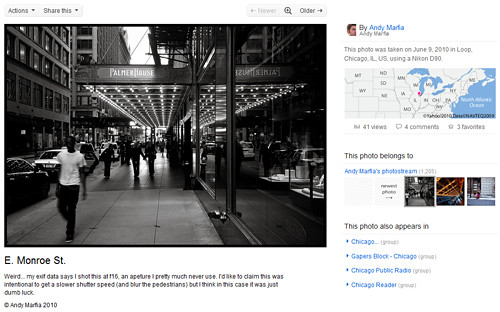
If you're a flickr addict like me, you've probably noticed that flickr is previewing a new design and interface for their photo pages. Log into flickr and look for a message at the top that says "take me to the future". Click on that and you'll see what I mean. The new look is pretty dramatic. I've been playing around with it for a couple of days now and here are the notable changes:
Increased photo sizes:
This is the biggest and most obvious change-- photos are now displayed at 640 pixel widths instead of the old default of 500 pixels. This is why I titled this post "flickr takes steroids" because the photos look supersized. Overall, I think this is a very positive change. 500 pixels always seemed a little too small to me. Especially in instances where members had disabled viewing the large versions for copyright protection, it made it hard to fully judge the quality of the photos. This remedies that. 640 pixels seems plenty big.
Improved viewing – 'large on black' now built in:
For years now, flickr members have been using workarounds (myself included) to show their photos on darker backgrounds. Flickr has clearly noticed this as they've built in that functionality to the new interface. Above each photo is a magnifying glass that takes you to a large version of your photo on a dark background. Once there you can click "view all sizes" to see the other sizes available.
Improved Copyright:
One thing that always bugged me about the old version of flickr was that the copyright seemed buried at the bottom of the page. Whether you elect to "All Rights Reserve" your photos or use a Creative Commons license, it's important that visitors can find that, and it feels a touch more prominent now. In addition, it's clear when you view the photos on other pages. For example, if you're on the "large on black" page, and you right click on the image, this brings up the copyright message. Then, if you click over to the "view all sizes" page, the copyright is prominently displayed at the top. Nice.
Downloading changes:
In the past, if you elected to not allow people to download your photos, this completely disabled the "view all sizes" page. Now, that page is available but it says prominently at the top "The owner has disabled downloading of their photos" under the copyright. In addition, through some magic of javascript or css (I haven't had a chance to examine that yet) flickr has disabled right clicking to download a photo. This works in Firefox, Safari, and Chrome, but sadly not IE.
This is not likely to please everyone, but I'm okay with the new setup. I have no delusions that anything flickr does will keep someone from stealing one of my photos if they're truly intent on stealing it. You know who you are and you know how it's done-- I don't need to explain it to you. But this new system does make copyright more prominent and should at least dissuade casual visitors from stealing, while at the same time allowing members to view the larger photos if they so desire. It's a balancing act and there's no perfect solution.
Photo titles moved:
This is a small point, but I'm glad that flickr has finally moved the photo titles underneath the photographs, where they belong. If you walk into an actual gallery with photographs hanging on the wall, no one writes their titles above the photo in big block letters. It's underneath. Why should online photos be any less classy?
Lots of other changes:
I could go on and on. If you geotag your photos, the map is now displayed to the top right of the photo. Tags are now displayed in a word wrap style instead of top to bottom, which is a much more effective use of space. Favorites now appear with the comments. Most of the icons above the photo have been moved into a drop down menu. Etc, etc.
Have I missed anything important? Leave a comment and let me know. For more information, check out the flickr blog post or the new group they've created.
1 comment:
I agree that the increased photo sizes is a welcome change. The only thing I don't like is the emphasis on geotagging. I don't geotag and I wish there was a way I could just turn that off completely.
Post a Comment