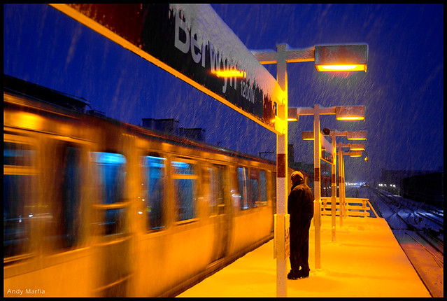
Nikon D7000 w/ 16-85mm, 1/20sec at f4, ISO400. © Andy Marfia 2011 All Rights Reserved.
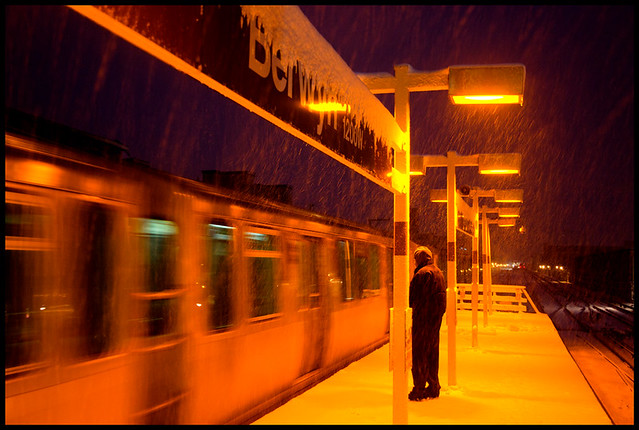
At the time, I debated between that version and the following:
© Andy Marfia 2011 All Rights Reserved.
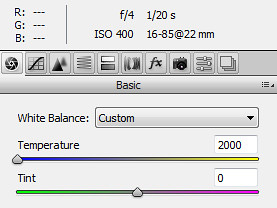
I thought I'd let my blog readers see them both. Of the two shots, I find the first to be more attractive, but the second is closer to what the camera recorded-- it's a more accurate document of the moment. This was at the very tail end of the blue hour, so there really wasn't much blue in the sky-- it was more of a deep, dark purple. I wanted it to be closer to blue, so I adjusted the white balance from 2850k to 2000k when I processed the RAW file:
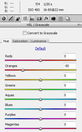
I also made an adjustment to the orange channel (dropping the white balance that low had turned the orange lights into a soft yellow and I wanted to retain the orange):
If you have a preference between the two, leave a comment and let me know? Note: there is no right and wrong answer. Night photos are tricky to process-- city lights can be a variety of color temperatures, and sodium vapor lights (which are in decline but still prominent in Chicago) often leave the world a garish orange. Whether you like that look or not is quite subjective. For me, it varies from photo to photo. Also, sometimes you just have to throw your hands in the air and convert everything to black and white.
4 comments:
First one (with the purpled sky), even though it isn't quite "natural".
I like them both. As part of a photography class I'm taking, we had to shoot on auto for a week. I work all day, so most of my shots were done at night. I faced the same challenge as you - I wanted to remain true to what I saw & the camera caught, orange lights and all, but I felt that the pictures needed to be tweaked a little too. You take incredible pictures, Andy. Thanks for sharing them!
Yay for sodium vapor lamps!
I vote for the second because, as Swanksalot mentions, the sky looks unnatural in the first. That said, the second suffers a bit of highlight burning that may turn people off.
And like you say at the end: B&W fall back!
I'm not bothered by the blue sky as that reads as blue hour to me. What does bug me is the ultra blue CTA car-- that's much more revealing of the processing. Still, I'd give a slight nod to the first shot as the second one just isn't as appealing.
Post a Comment